Saturday, April 13, 2013

best. trip. ever.


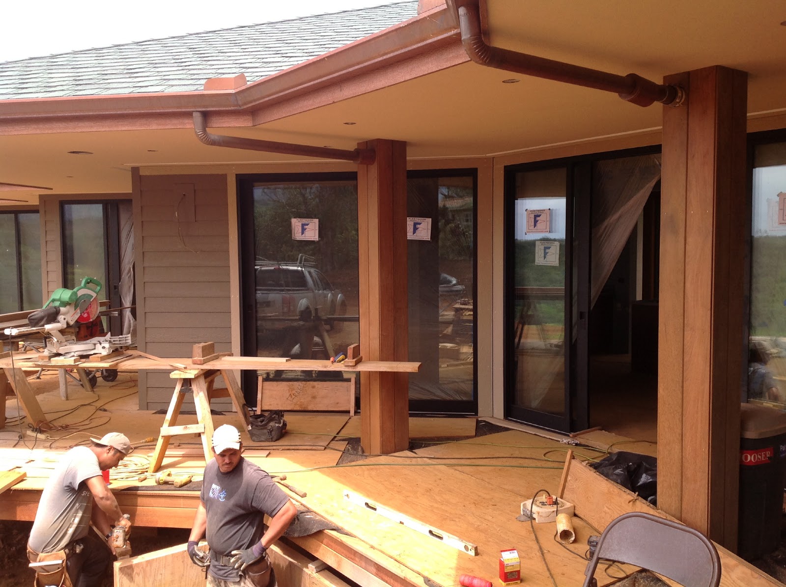
 a friday-to-tuesday trip over easter was very productive.  it seemed every trade was in or on the house friday and lots of open decisions were closed.  cabinets are in as are window casings and the replacement fleetwoods.  guest tile is complete, master tile is starting, and mirrors have been spec'd.


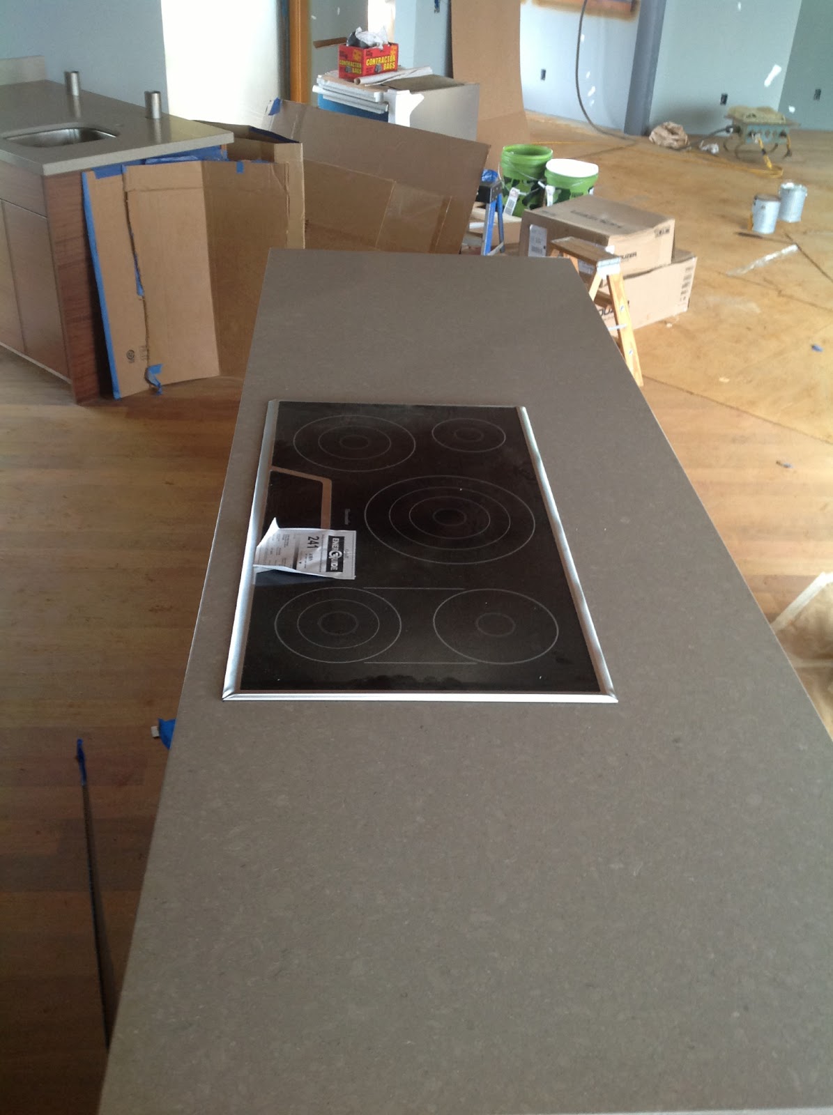
 the quartz counter tops arrived from oahu as did the crew to install them which took only a few hours.  i'm happy with the shiitake tone and the splash and edge detail.  there are some leftover quartz remnants the tile installer offered to make tables out of.. i took him up on that.

we addressed the copper "coffee cans" that transition the downspouts to the ipe columns on the lanai.  they will be replaced by something lower profile.  i hope.  other copper numbers came in for the porte cochere columns and we are in the ballpark, though there is some light concern over adhesive. 


we came to consensus on the front steps.  sort of.  they will be slate and return back to die into the columns.  the south side will extend several feet for a bench and a place for shoes, etc.  at least that's the idea.  there's isn't a lot of room for the steps because the porte cochere drive-through is pretty wide, and that's a good thing.
light gray is slate, dark gray is interior (also slate), brown is columns

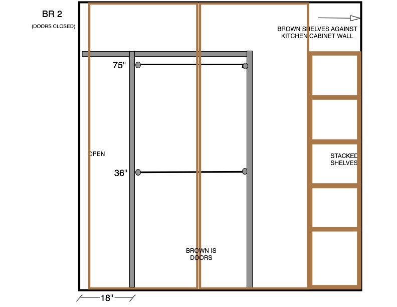
 i hope the closet shelves function as good as they look.  my designs are rudimentary, but the physical manifestations of them are impressive.


we went with rolling shades only on the sliding bedroom doors.  i need to order these soon.  other shades will be decided after spending time in the house and sleeping at various times of the year.


sliding door shades in Hadrian Wall blackout fabric


 the LED light coves in living and master are underway.  we mocked up a few designs and finalized dimensions and details.  a light sanding of the first cedar board at the east wall acts as a poor-man's diffuser in the living room.  master coffers are more traditional frames with tilted shelves for the LED tape.  porte cochere rope light cove is already complete and looks good.


 built-in (cantilevered, really) shelving has been designed and dimensions finalized.  all shelves are in twos: office and master tub have a 75% offset from bottom-to-top, guest baths are parallel, and the mirrored bar has about 10" of overlap.

 next trip is move-in, so to speak.  mid-may i plan to sleep in the house and begin to accept furniture deliveries and houseware shipments.  famous last words.


me & bleu at smalltown coffee in kapaa
 

Sunday, February 17, 2013

finish line


take it from the ground up
  a quick two-day trip last week made it clear i was at the finish "line".  not completely done by any means, but at the point, the line, where most work being done is for finishes..  ie: things that will be seen or felt throughout.  choices i made months ago start showing up in the form of actual materials and fixtures.  and, everything working's out well so far (fingers crossed).


 all paint colors are final and a single coat of most are up and look acceptable.  wood doors are being stained in the garage and the wood floor is completely down.  i went over closet shelving with the builder and have most details figured out.  bedroom closets will be wood-stained shelves, pantry and utility closets painted.


 cabinets are going into place.  i found this is the only area where i'm afraid/worried seeing them being unpacked and set into place.  it's like i forgot something, or there will be trouble with something not fitting into place.  fortunately, the crew is fantastic and no speed bump seems to slow them down.


tile design is done, tile is on-site, and will be installed this week and next as it goes down on the floor and up on the walls.  i helped the tile guy bring into the house boxes of tile and counted it as a workout because they were f!cking heavy.  we unpacked and they all look great.  the pattern repetition of Dal Steel Structure is a bit disappointing, but the tile guy says he can make it work.


the dryvit is done and the lighter color looks good.  i treated it like a ceiling and deferred to architect and builder for a recommendation from a subset of colors i picked.  it's smooth finish tightens up the exterior lines of the eaves, porte cochere and all corners.


work has started on the replacement fleetwoods.  i lost the buyer for one of the three old doors, so i'm back to storing three beautiful aluminum sliding doors in the garage.  (anyone interested?)  i'm looking forward to seeing and operating the new doors.


  a stopover on oahu to pick guest bath surfaces out of existing remnants of old jobs was wildly successful.  had a great ride up to kailua where fabrication facility is.  found a nice, pre-laminated piece of caesarstone (same quartz as rest of house) in "pebble".  it took about 45 seconds to find.  the rest of the time i played with George, a dog who will lose his hearing way before other dogs his age from the wet saws and CNC machine blasting non-stop.

stone sills in Caesarstone "shitake"
George
balcony in HNL (diamond head at right)
Winner!  Caesarstone "pebble"

the ride back from Kailua
 i don't have a trip planned until the end of march, but i have a bad (or good?) feeling i will need to return before then.

 aloha!

Wednesday, January 23, 2013

palette


Rob & Mishel painting color samples
 paint colors are a huge pain in the ass.  they all look great on the swatch but invariably look different on the walls.  on our visit last week, we chopped up several sheets of drywall and painted samples of colors i felt could work in the living room and master bedroom.  the guest bedrooms and garage are already decided, and most painted already.

 we took out pieces of the alder trim, cabinet paneling, & wood flooring to match them against the samples..

John does not like grays


 for interior, cool-neutral grays are used extensively to balance the warm tones of woods found on floor, ceiling, trim, cabinets, etc.  i found the same color card 29 to work in the living area as it had already done in the guest bedrooms.  the colors on this card have enough green in them to reflect what is happening outside on the valley wall.  for public areas, i stepped down the card to darker shades than the bedrooms.  the architect helped with accent walls and soffits vs window walls (i had it reversed).

 the entry is earth slate - as it is in san diego - which is blues, greens and tans.  i wanted the entry wall at 135 degrees to "float" against the other 90 degree walls of the living space.  the doorways in this wall do not have casing, so the paint wraps around to the hall space.  i needed something blue-er than card 29 and looked at card K already being used in the master.  this worked. 

Sherwin Williams card K


 as a result, the whole house is two SW cards:  29 & K.  these are Sherwin-Williams colors 6196 - 6202, and 7063 - 7069 respectively.  at request of the painter, i went through the house and marked on the floor what each wall is to be painted. 

 to my surprise, the drywall is level 5 finish, aka: baby's butt smooth.  a person is going through the whole house on a scaffold shining a bright light on every wall and sanding out imperfections.  this makes color choice even more critical.


guest bedrooms have an initial coat of color, and they do not look offensive.   each bed wall will be an accent Thunderous SW 6201, a theme carried into the master with Cityscape SW 7067 and into the living/kitchen walls with Link Gray SW6200. 

BR 3 - Aloof Gray SW 6197 flat
BR 2 - Sensible Hue SW 6198 flat


 note the two colors above:  Sensible Hue is in fact darker than Aloof gray, but because of how the picture is taken and where the light is sourced, it appears the opposite.

 current actions:  finalizing light switches and dimming on EM plan, selecting door hardware (interior and exterior), bath accessories, creating closet shelving elevations and ordering a garage door.